AIC’S NEW LOOK
Identity Design
Role: Designer
Instructor: Michael Konetzka
Tools: Illustrator, Photoshop, InDesign, After Effects
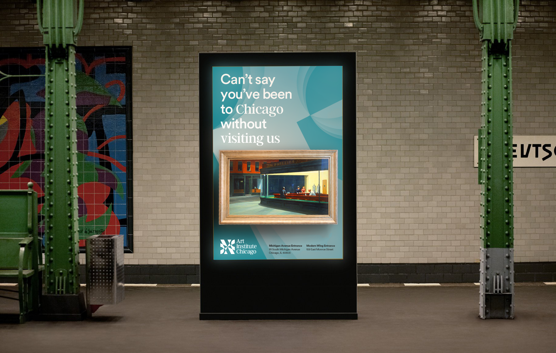
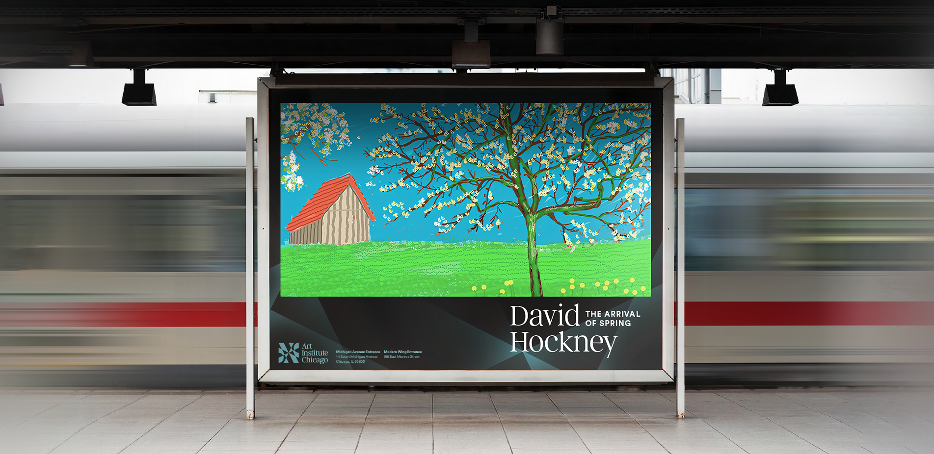
This brand redesign for The Art Institute of Chicago aims to enrich their graphic system, engage their growing modern audience, and enable the museum to communicate their missions on embracing diversity & inclusivity in the art world.
The Art Institute of Chicago is one of the most renowned museums in the US and the country’s second-largest art museum, with over 300,000 pieces of art on display. It is where millions of visitors, artists and students from various backgrounds all over the world gather to enjoy the art. One of the museum’s foremost missions is to create an antiracist community, built on the intersection of equity, inclusion, and justice for all.


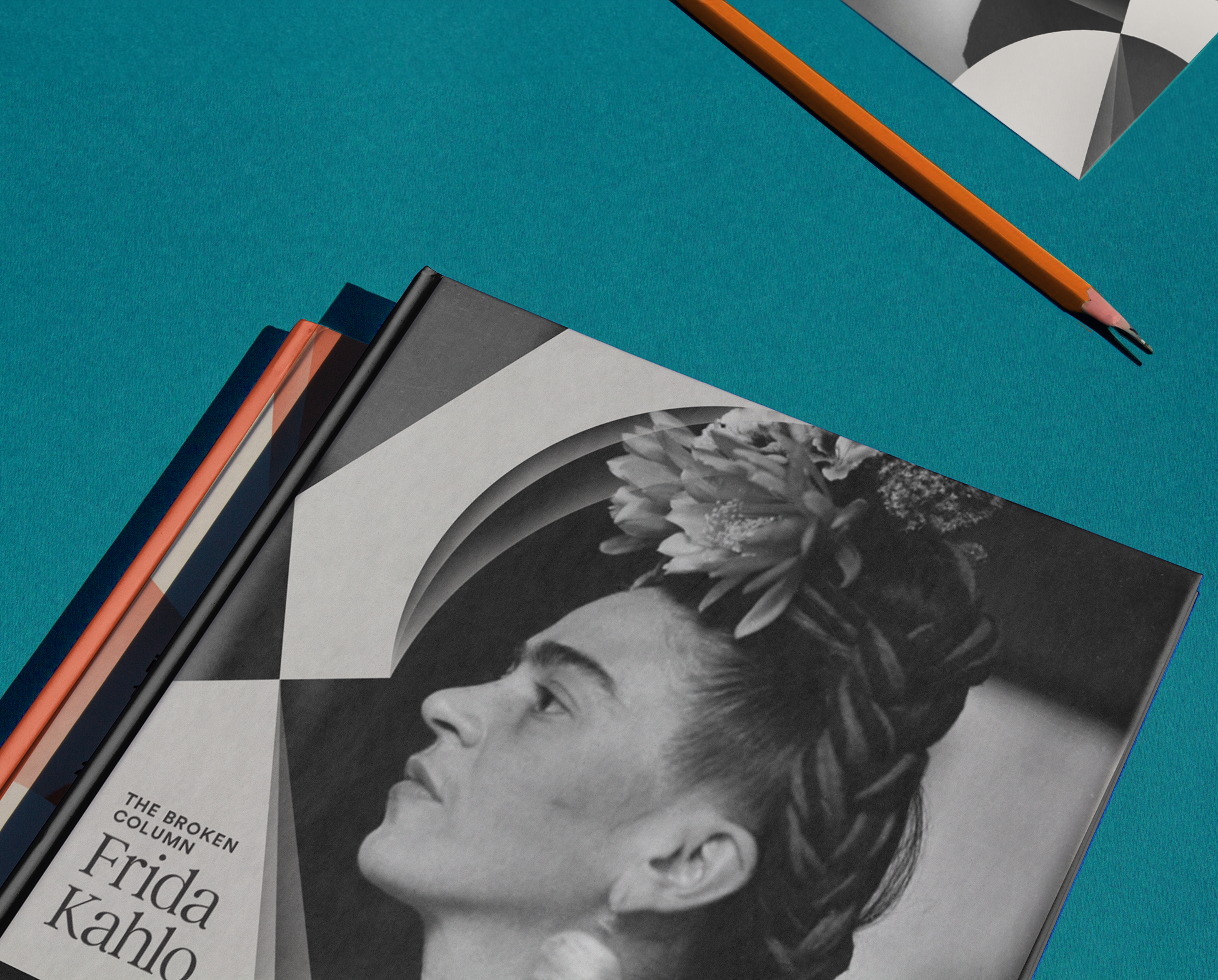
The contrast in the stroke weights of the serif typeface (Argent CF) works perfectly together with the geometric mark to reflect both classical and contemporary aspects of art. Its tall x-height when applied in titlecase creates harmonious spacing between each word and helps increase readability.